


UX Researcher, UI Designer, UX Deigner
10 weeks
Comparative analysis, Interaction design, Information architecture, Prototyping, Usability testing

Mobile US, Inc. is a wireless carrier based in the United States. In addition to a variety of data plans, the company provides consumer, business, and prepaid wireless connectivity options.This project looks into how the largest telecommunication provider has a plethora of services to offer for postpaid and prepaid customers and it fundamentally focuses on how the motive of ergonomic website design is lost owing to factors discussed below.
The project was completed in four stages, with ongoing iterations and the development of a final solution to fulfil our project goals.
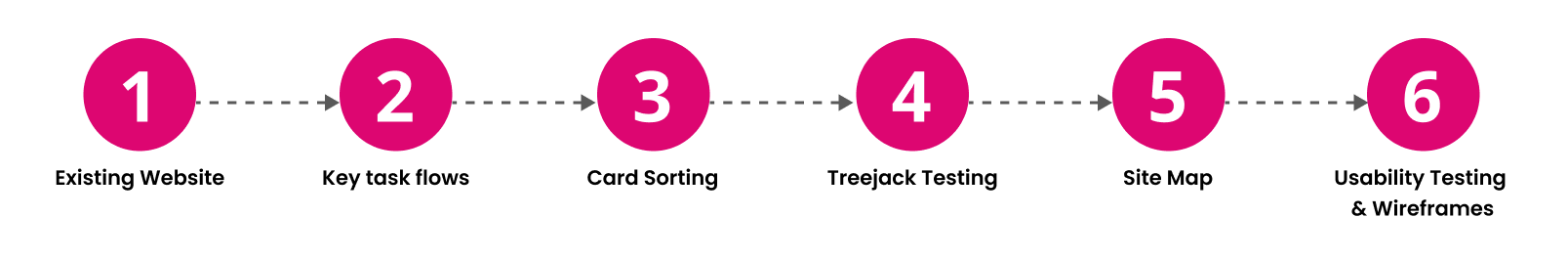
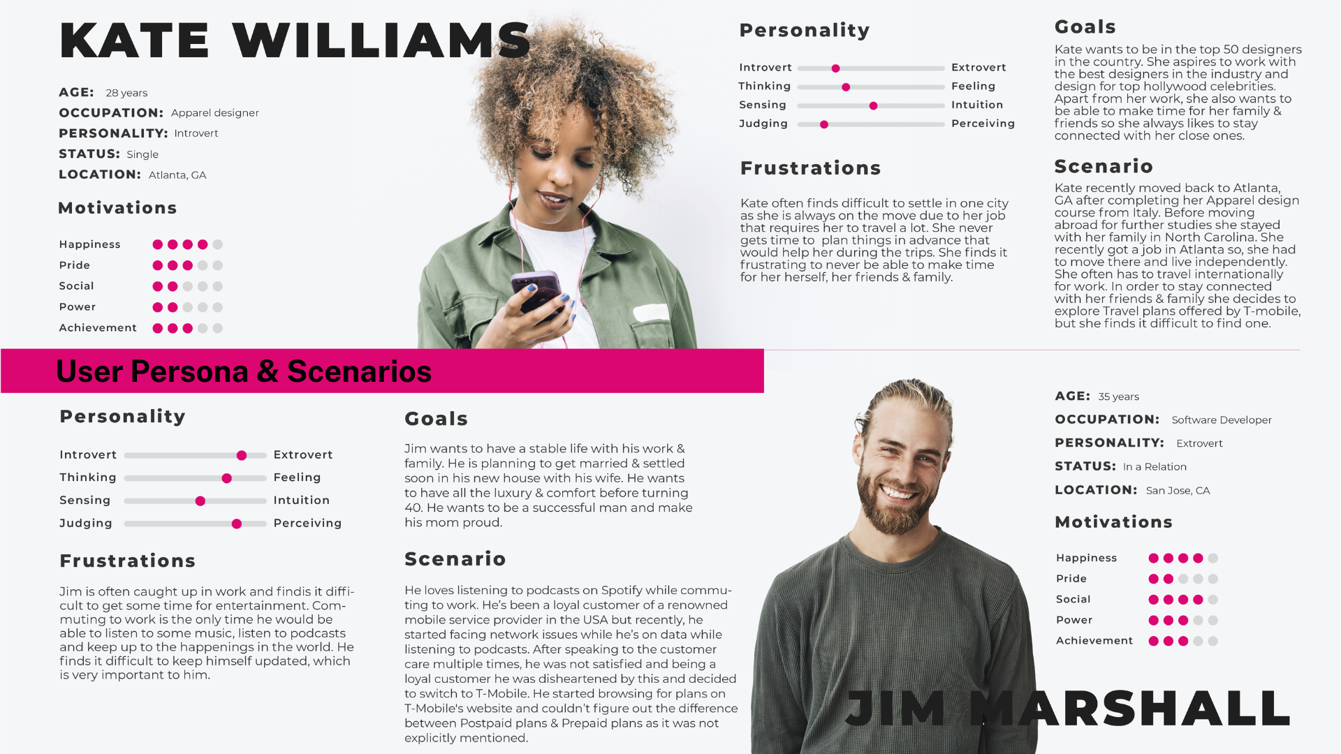
After understanding the website's flow we constructed and designed our user personas
Following tasks were the main key tasks of our project :
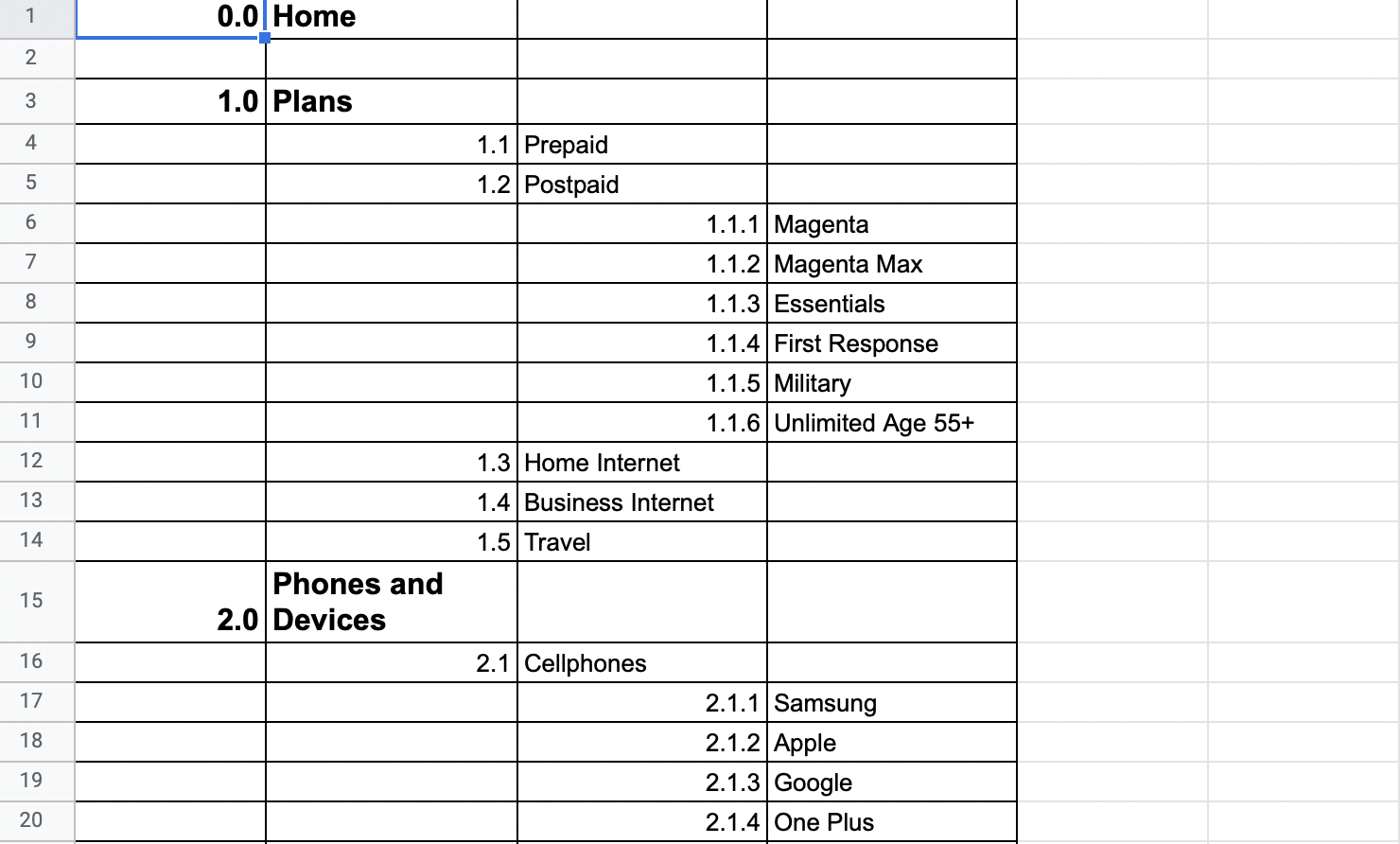
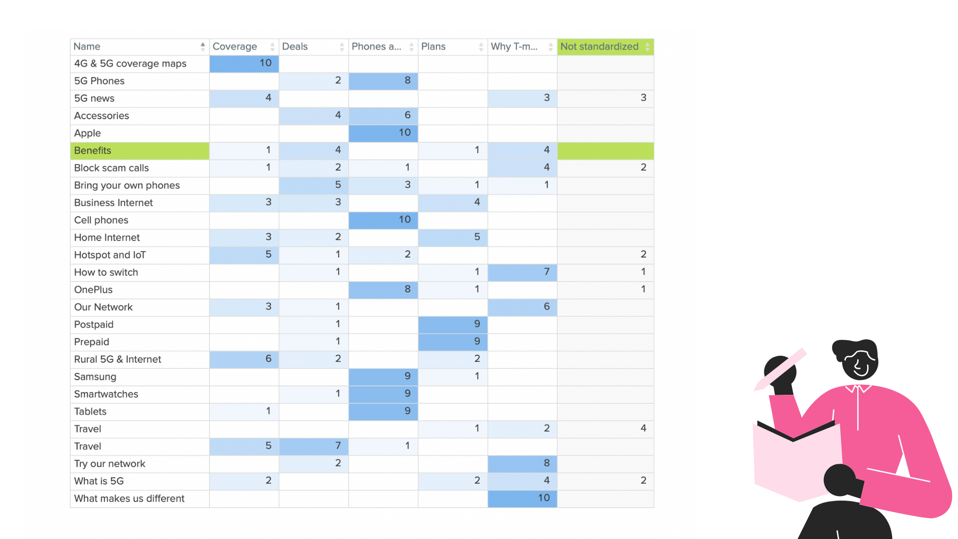
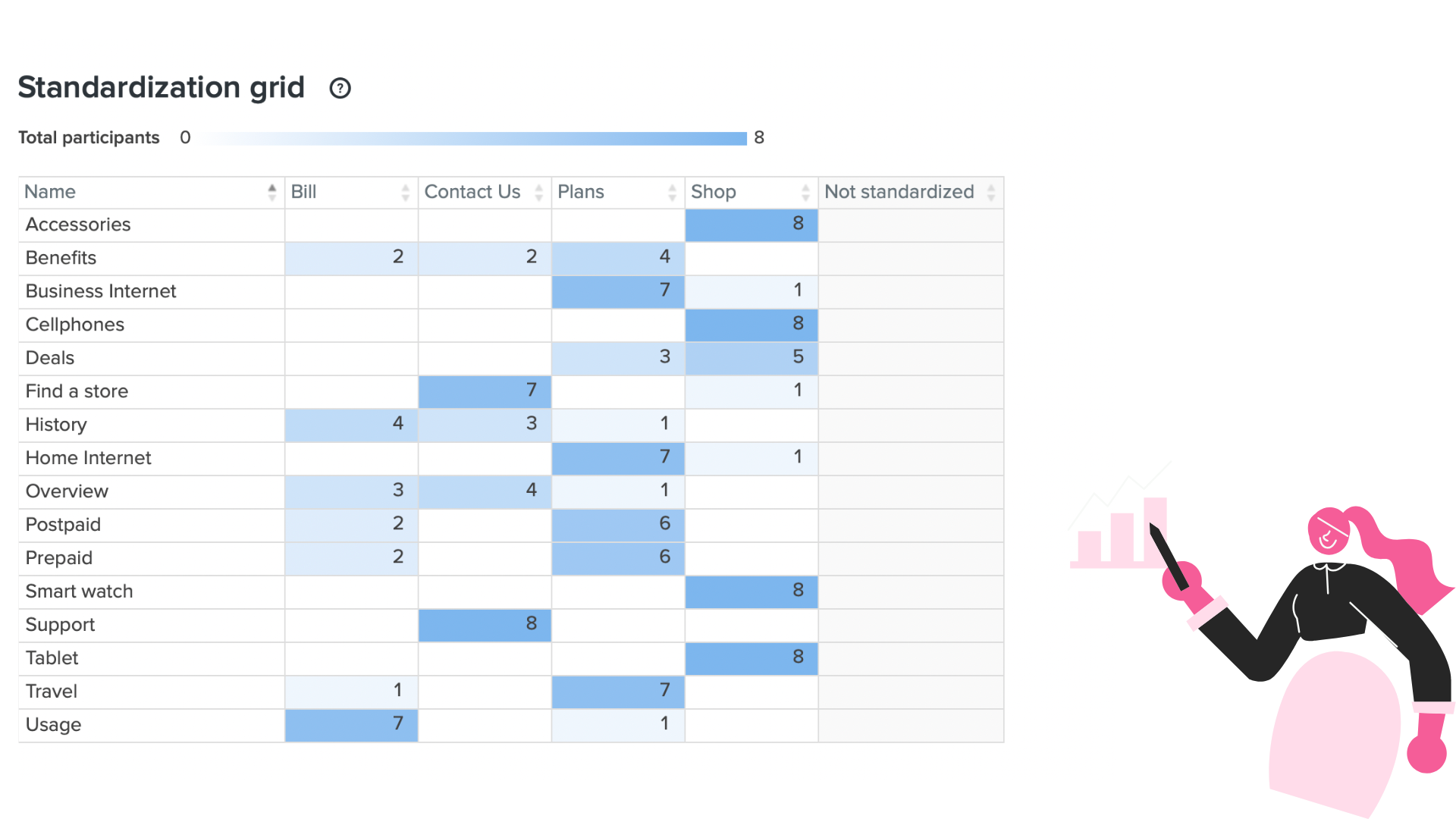
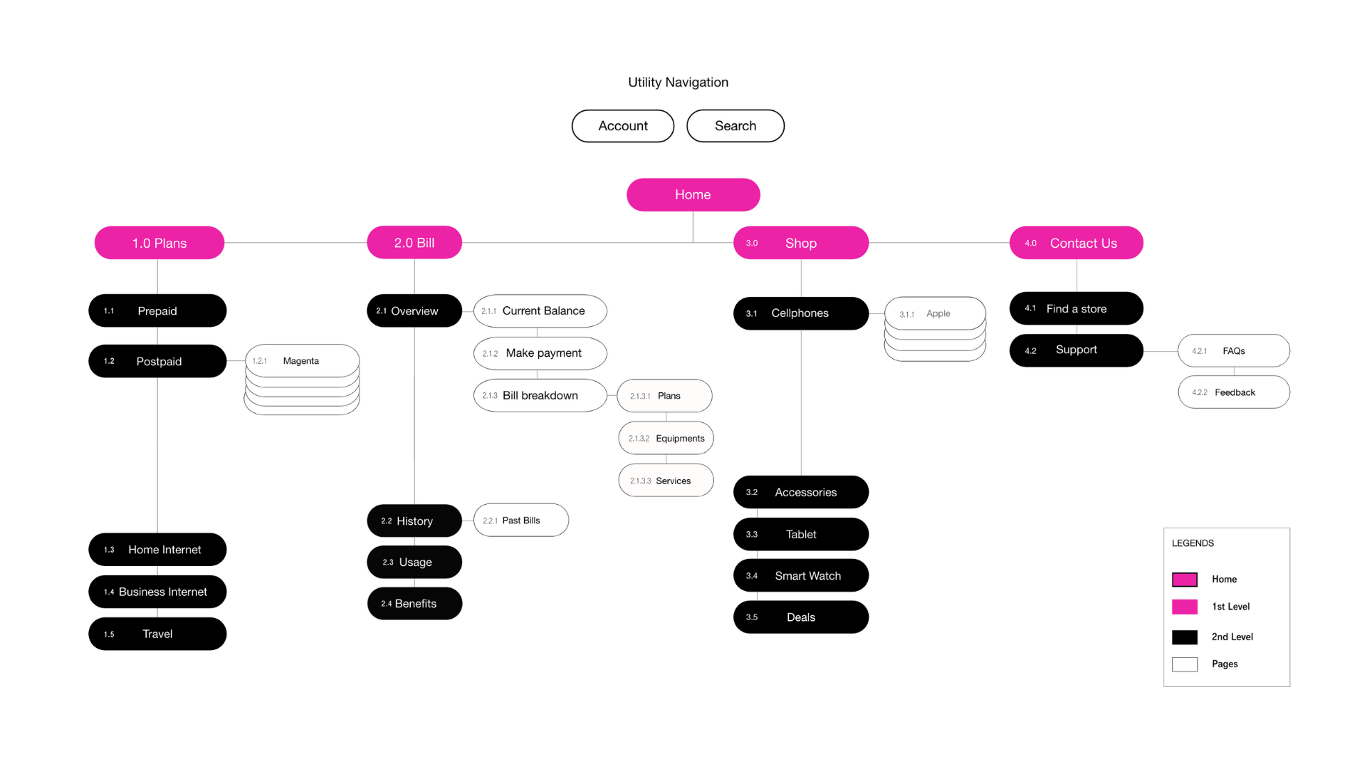
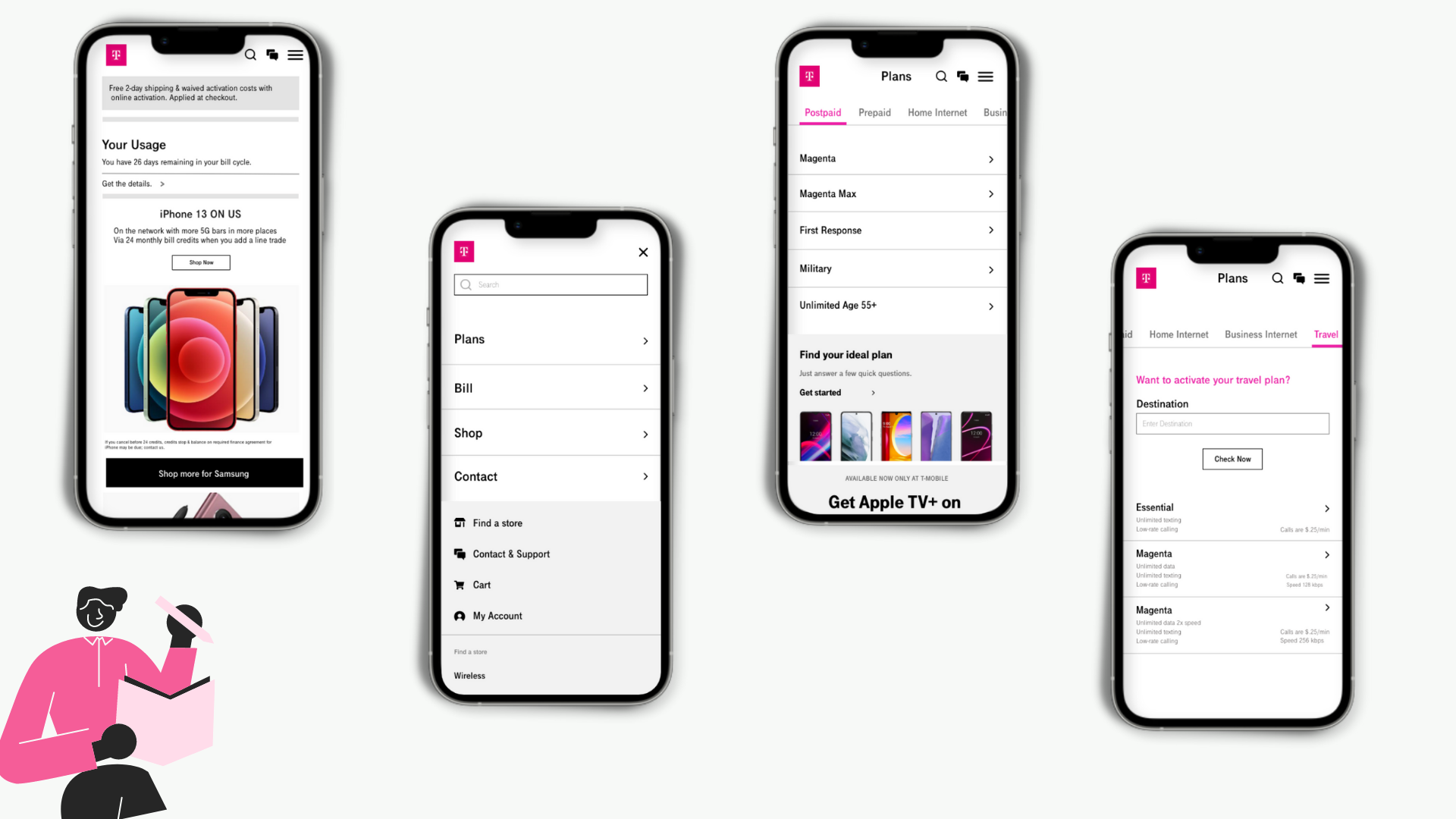
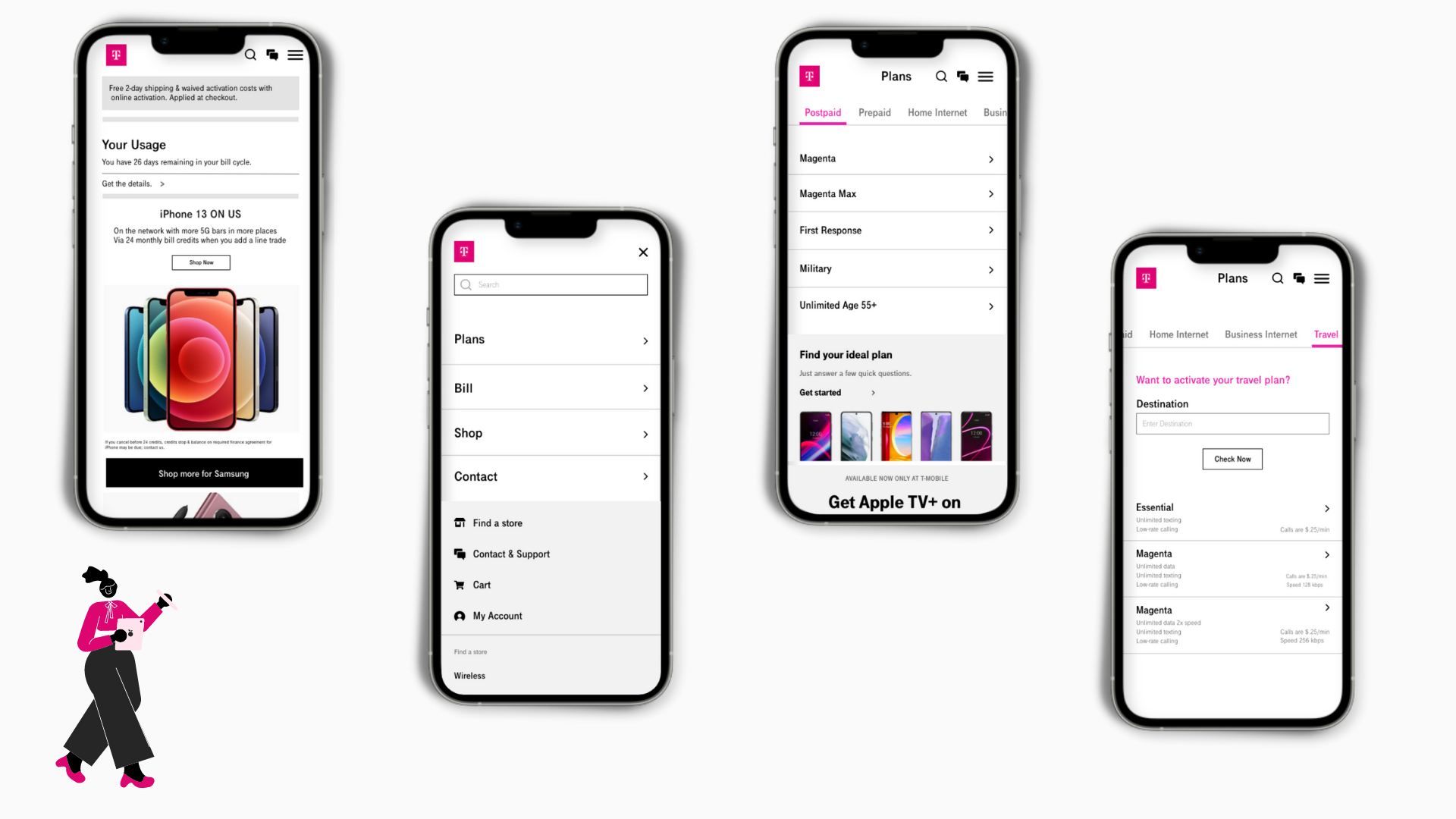
We listed all the possible navigation and categories of our project T-mobile. Then we sorted them into least contents making it easier for users to understand and for better understanding of how the navigation works.
We conducted two rounds of card sorting. The participants were DePaul students and friends.
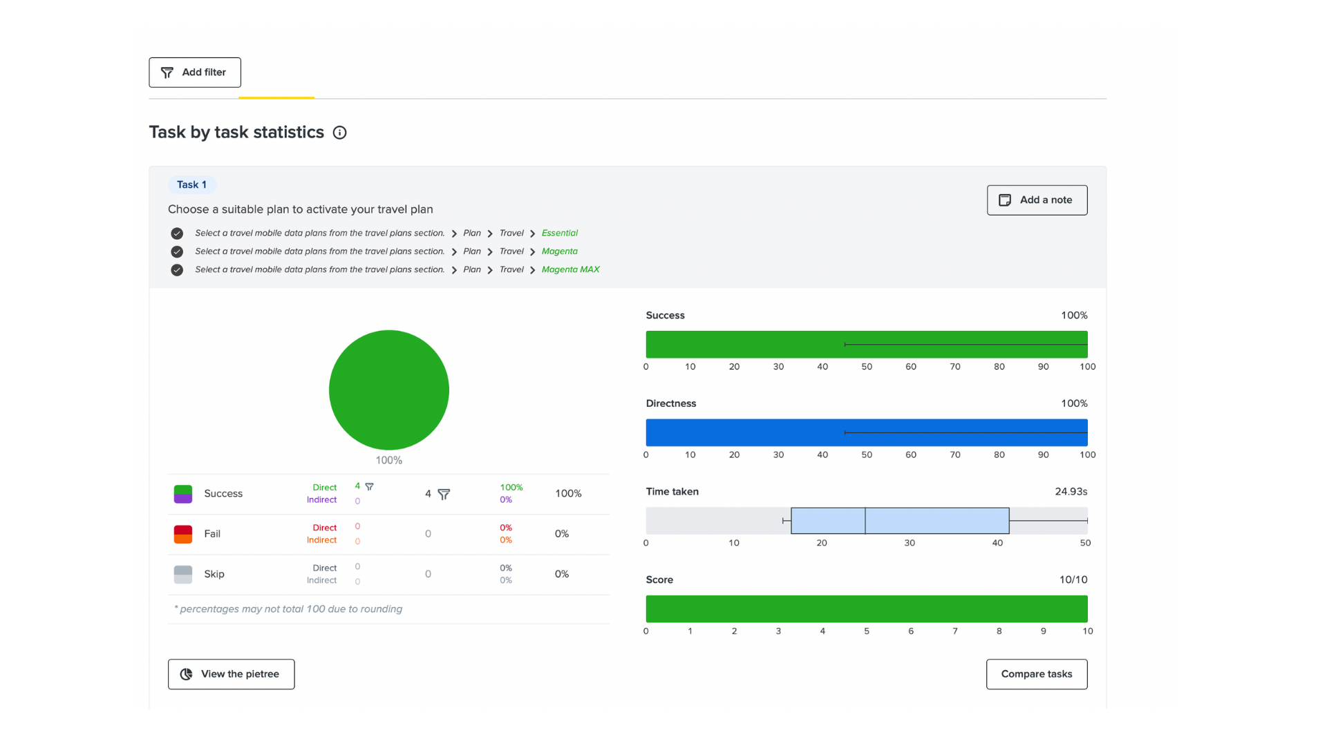
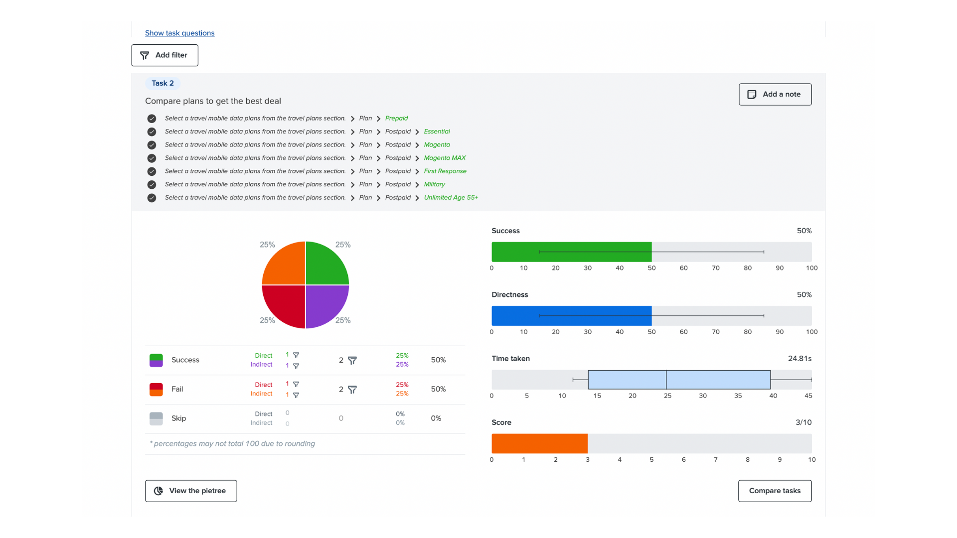
We conducted one round of Treejack Testing. The participants were DePaul students and friends.
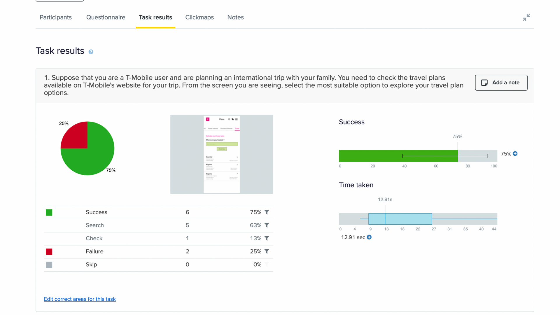
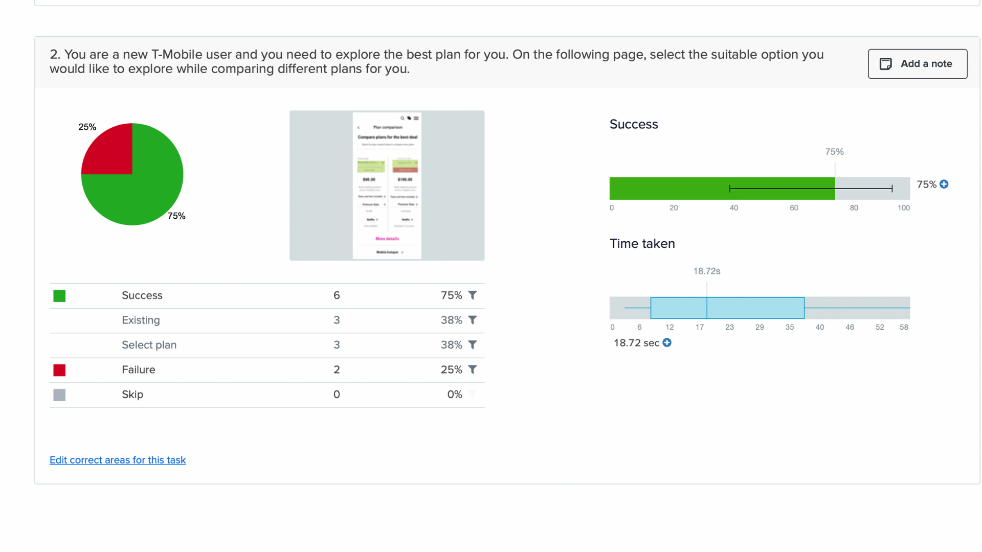
We conducted one rounds of chalk mark test. The participants were DePaul students and friends. In overall, we found over 75% of success rate in all our chalk mark tasks.
Task 1: Choose a suitable plan to activate your travel plan
Task 2: Compare the plans to get the best deal
Task 1: Compare the current plan with other plans to get the best deal
Task 2: Compare the plans to get the best deal
In this project, I learned how to resolve some key issues on an existing website by organizing content effectively throughout the site. Ineffective information architecture can mislead users who are trying to accomplish a specific task. I also learned different types of Usability testing methods used to validate our iterations in the navigation menu. During the process, I discovered how significant it is to test my iterations at every step.

